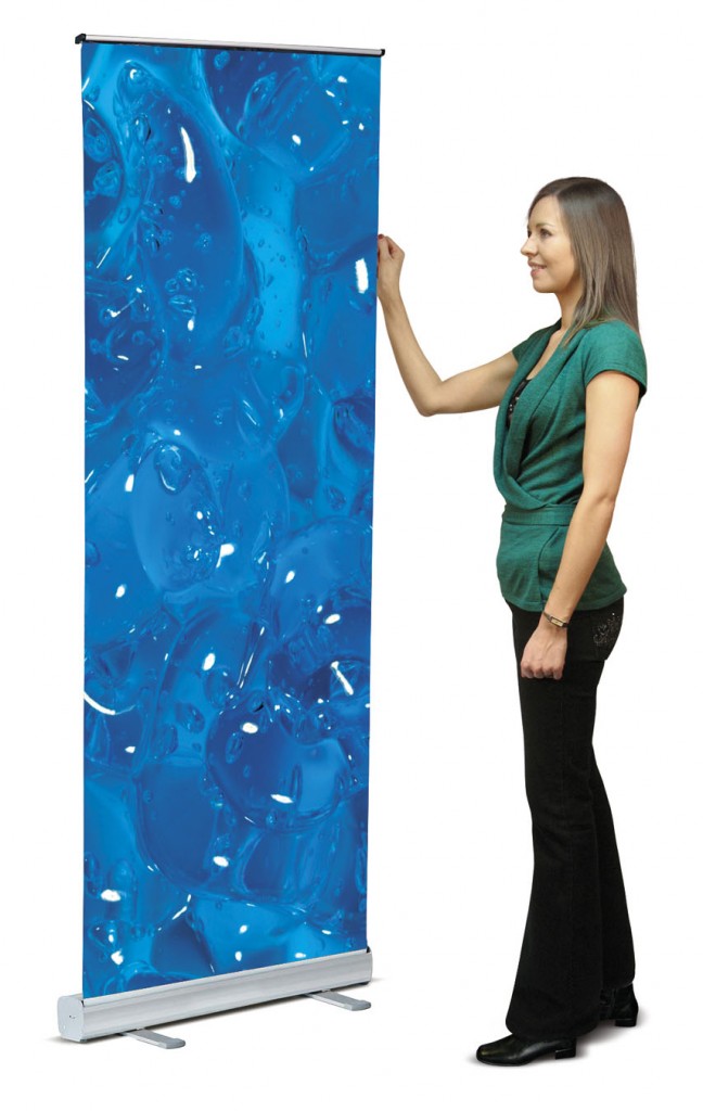
If you are currently designing your pop up display, it is likely you have been advised a roll up banner stand will be a great addition to your display. As well as being really useful in bringing to life an exhibition or retail display at a trade show, roll up banner stands can also look great in business premises as well, so they are extremely multifunctional in their use.
It can be difficult to know exactly how the design of the stand should look, especially when it is so important that the design and information listed work well to have an impact on those viewing the banner. As the banner is going to be used to provide information and a visual queue, it’s important you spend as much time designing it and tending to it as you would with any other marketing material like leaflets, online adverts or business cards. As the banner is being used to advertise your business, a product or message, it’s extremely important it is designed exactly right so that it can serve its purpose well.

Here are a few tips to help you get the design of your rollup banner spot on:
Keep Your Logo Tops
Whatever it is you want your customers to read first, put it at the top. It could be the product you are advertising, the message you are trying to get across or simply the company name. Whatever is most important in this campaign needs to go at the top of the banner. It all relates to the simple rule of having everything you want the customer to notice straight away at eye level.
Consider The Way People Read
Remember that people read from left to right, top to bottom, so again when it comes to prioritising information, you will want to think about the way people naturally scan any piece of information.
Keep It Simple
One of the most simple rules in any advertising or marketing is to completely minimise information as much as possible. You need to keep the information short and sweet so that customers are able to quickly gather and retain the information from your rollup banner amongst the other popup stands in the room. Any sentences, phrases or paragraphs – cut them down. Try to think about the simplest way you can communicate your point in as little words as possible.
Make Sure The Images Look Good
Visually, your roll up banner needs to look great and part of that will be the quality of the images used on it. Using poor quality images on a roll up banner will make take down the overall town of the banner and won’t show your products at their best. You want people to notice your rollup banner for the right reasons not the wrong ones, so invest in high quality images and print to ensure they look fantastic.
Use Colours And Tones
Remember, you must get the colours and tones on your rollup banner right to ensure information stands out and your brand message is clear via the colour scheme. Work with contrast between colours and consider the message each colour scheme will immediately send out. Consider visibility from a distance and up close, and consider the colours and tones of your rollup banner against the other components of your display. Remember that the best popup stand companies will help you design your display so they will be able to advise you on matching all the elements of the display together.
Market Your Business!
Make sure your banner has a CTA (call to action) on it so that its leading people where you want them to go. If its marketing a social media campaign, make sure you list the hashtag or the Facebook page the person needs to go to. If you’re offering a product promotion, list the promotional code or tell them where they can find the product. At the very least make sure your contact details are listed on the banner so customers know where to go for more information if they want to find out more when they leave the trade show or your shop.
Remember, if you get the design of your rollup banner right, it will have a massive impact on your campaign or display, so it’s worth taking the time and effort to get it right.


